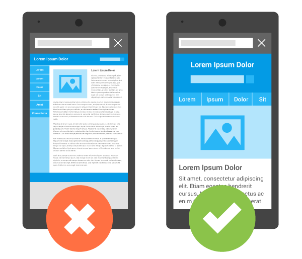
The only thing more important than having a website is making it easily accessible to everyone. In 2018, people of all generations regularly use multiple devices. Once you’ve covered the website basics, it’s time to make sure that your site functions no matter which way visitors would like to access it. The technical term for this is responsive design, meaning that your website is capable of functioning seamlessly with the formats that correspond to the display sizes of all devices. There are a fair number of sites that have not yet taken this next step, but it’s safe to say that these sites are behind the times. Read on to learn more about how taking this step can help your site remain competitive.
Promotes a Greater Reach
A mobile responsive website allows you to connect with more people than you would otherwise. As I mentioned earlier, most people use different devices at various points in their day. Picture the people you want to target with your website using their mobile phone while they’re out and about, curling up on the couch at home with their tablet, or surfing the web on their work computer during a break. Making your site accessible to every person in every configuration ensures that more people will visit it.
Makes a Positive First Impression
Using a responsive website design means you make the site more attractive to visitors. Almost everyone has had the experience of opening a website on a mobile device only to find that the layout is distorted and the text is difficult to read. There are still plenty of websites out there that don’t use responsive design, so encountering one that works smoothly on a mobile device creates a sense of satisfaction in visitors. First impressions are crucial, and a responsive website will go a long way to give readers a positive opinion of your site from the first time they access it.
Encourages Visitors to Stay Longer
After catching people’s attention, the goal of every successful website is to keep visitors on the site. A responsive website does just that. Ensuring that visitors to your website encounter an attractive and easy-to-use design on a cell phone, for example, will keep the bounce rate (the percentage of people who leave your website without navigating to another page on the site) low.
Compels Visitors to Engage With Your Content
A universally accessible and attractive website is one that visitors will feel compelled to interact with. Whether your website is commercial or informational, making it convenient for people to shop or read your content on the go means that they will do so more often. As an added bonus, they will be more likely to share your content more frequently, thus bringing your responsive website to the attention of an even greater number of people.
Boosts Search Engine Optimization
Google itself has recognized the importance of responsive sites and favors them in the rankings on its Search Engine Result Pages (SERPs). In other words, using responsive design for your website is an effective method of SEO (Search Engine Optimization), which will boost your visibility on search engines. Moz provides tips on further ways to improve the mobile optimization of your responsive site, such as minifying code to increase your page speed and making sure that the interactive parts of your website are designed to be easily clickable for computer mice and fingers alike.
Saves Money
While switching to a responsive website does involve spending more money initially, you will save money in the long run. This is because the alternative to switching is having separate websites, one of which is optimized for desktops, and the other for mobile devices. Having these two versions involves paying double the development, hosting, and maintenance costs. Meanwhile, making your site accessible to all devices results in only needing to budget for the cost of one website. You can even save costs further by enlisting the help of a specialized service to help you make the switch.
Saves Time
Once you’ve cleared the initial hurdle of making your website mobile responsive, you will only need to apply your technical and content updates to one version of your website. You can use the time you save to work on the parts of your website that you’re really passionate about, such as developing new products or written pieces. Just like any good new year’s resolution, switching to a mobile responsive website format in 2018 allows you to focus on your priorities.
The post 7 Reasons Why Making Your Website Mobile Responsive is Crucial in 2018 appeared first on The Crazy Programmer.
from The Crazy Programmer https://www.thecrazyprogrammer.com/2018/04/making-your-website-mobile-responsive.html
Comments
Post a Comment