R programming was developed in 1993 for making graphs and producing statistical results. There are many libraries in R language that can be used for making graphs and producing statistical data.
There are many steps that have to be taken into consideration for doing data analysis through this language. These steps are:
- Programming
- Transforming
- Discovering
- Modeling
- Communicating
R programming is being used in many industries like academics, healthcare, government, insurance, retail, media, manufacturing, etc.
This data analysis can be done through programming in R language which comes with a number of packages having many inbuilt functions and this is the reason that developers do not have to program much. They just need to use those functions and carry out the analysis.
Why R Programming?
R Programming can be used to create statistics and graphs. The language has become very popular and people who want to make their career in this language can undergo R certification online through various institute who provide in-depth knowledge of R.
R certification when seen today can prove to be very useful for students and they can plan a good career after the certification which certainly gives an individual an upper edge over others.
Data Visualization in R
Many types of data visualizations can be created through the language and these are:
- Histogram
- Bar / Line Chart
- Box plot
- Scatter plot
- Heat Map
- Mosaic Map
- Map Visualization
- 3D Graphs
- Correlogram
These will be discussed one by one.
Histogram
A histogram can be created by using histdata package that has many small data sets to create the histogram. A histogram can be used to break data into bins and show their frequency. Here is the code in which histogram is created. Here is the code of creating a simple histogram.
hist(Temperature,
main="Maximum daily temperature ",
xlab="Temperature in degrees Fahrenheit",
xlim=c(50,100),
col="darkmagenta",
freq=FALSE
)
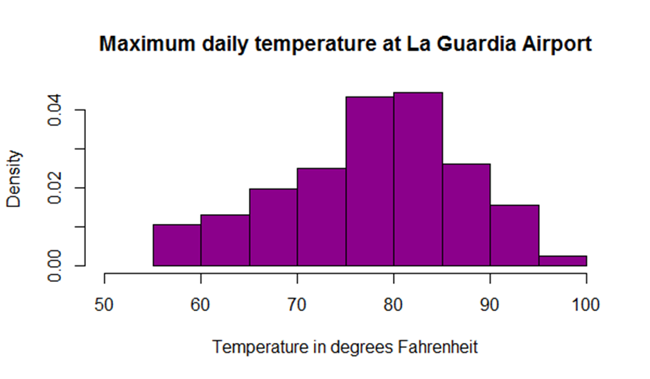
While creating a histogram a developer can see that number of colors specified is more than the number of breaks. The colors are repeated if the number of colors is more.
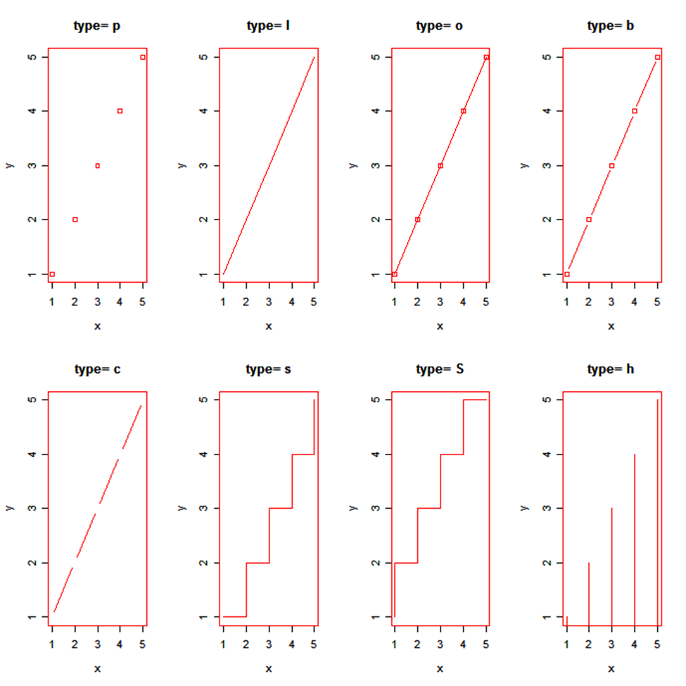
Line Chart
A line chart shows an increase in the data for a given time period. Line charts are created to compare the changes between two organizations or between weather of two places or other comparisons. Line charts are also created to analyze the trends over a particular period.
x <- c(1:5); y <- x
par(pch=22, col="red")
par(mfrow=c(2,4))
opts = c("p","l","o","b","c","s","S","h")
for(i in 1:length(opts)){
  heading = paste("type=",opts[i])
  plot(x, y, type="n", main=heading)
  lines(x, y, type=opts[i])
}
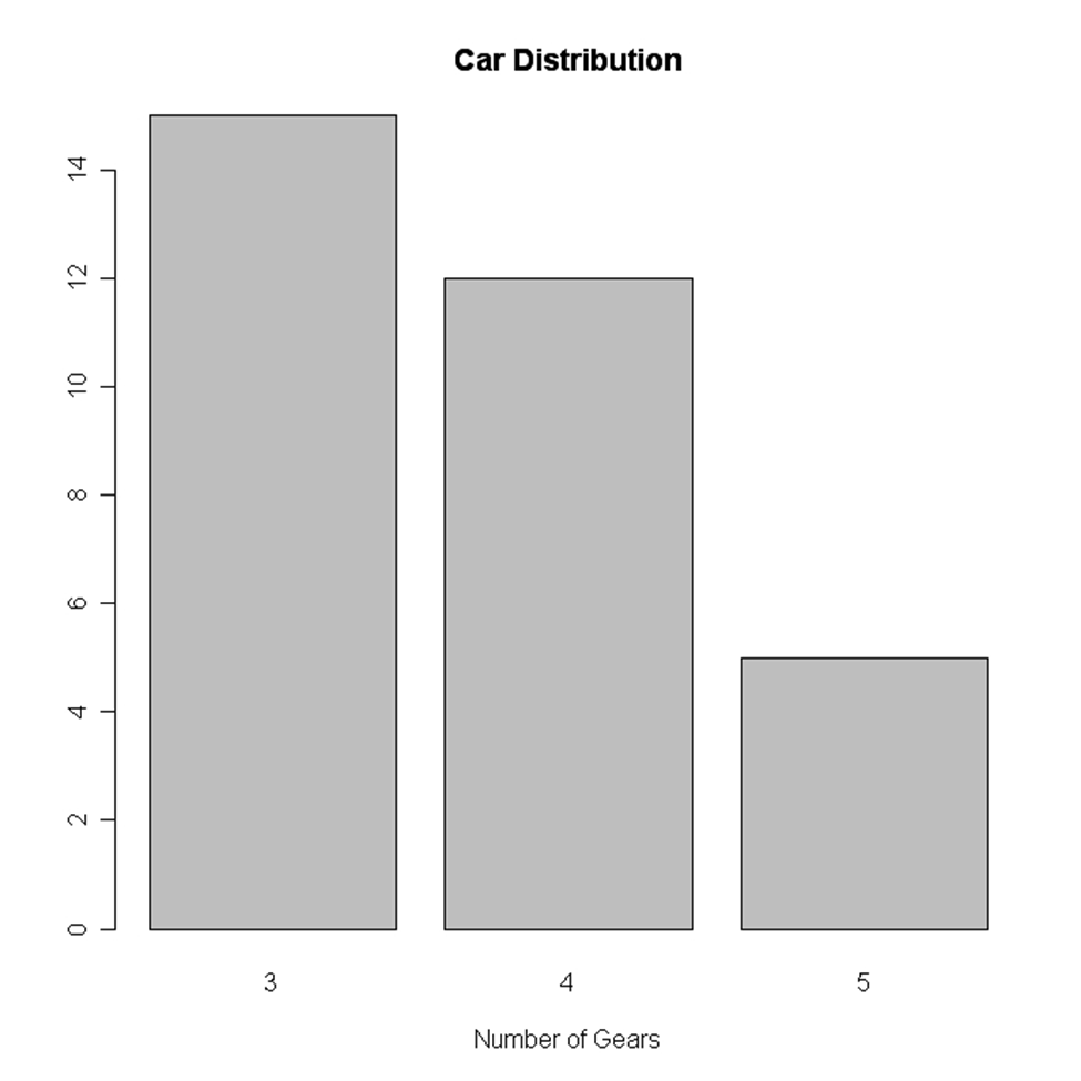
Bar Chart
Bar chart is also created for comparing profits or weather report or other comparisons. The chart is displayed in the form of bars. Here is the code of creating a vertical bar chart.
counts <- table(mtbikes$gear)
barplot(counts, main="Bike Distribution",
   xlab="Number of Gears")
Here is an example of creating a horizontal bar chart.
counts <- table(mtbikes$gear)
barplot(counts, main="Bike Distribution", horiz=TRUE,
  names.arg=c("3 Gears", "4 Gears", "5 Gears"))
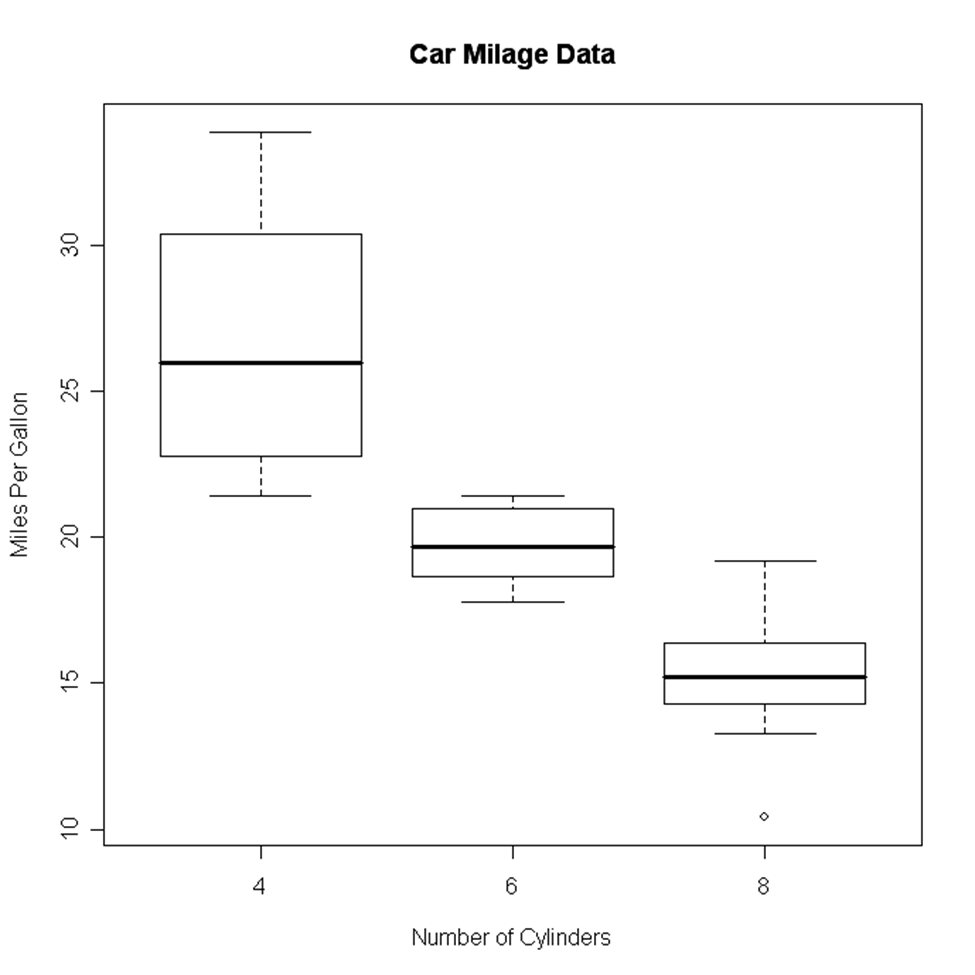
Box Plot
It is created either for a single variable or a group of variables. The syntax of creating a box plot is as follows
boxplot(x,data=)
Here x is the formula and data= is the frame which provides the data. Here is an example of creating a box plot.
boxplot(mpg~cyl,data=mtbikes, Bike Milage Data",
   xlab="Number of Cylinders", ylab="Miles Per Gallon")
Scatter Plot
Scatter plot can be created in many ways. The basic formula for creating the scatter plot is
plot(x, y)
Here is an example of creating a scatter plot.
attach(mtbikes)
plot(wt, mpg, main="Scatterplot Example",
   xlab="Bike Weight ", ylab="Miles Per Gallon ", pch=19)
Heat Map
A heat map is displayed in the form of a table in which colors are displayed in place of numbers. All the columns can have either same or different colors. The dark color denotes highs while the light colors denote lows. Here is an example of creating a heat map.
> heatmap(as.matrix(mtcars))
Mosaic Map
Mosaic Map can be created by using VCD library which has an ample amount of functions to create the map. The syntax for creating a mosaic map is as follows:
mosaic(x, condvar=, data=)
Here x is the formula and codevar is an optional variable in which conditions can be defined. The example below shows the making of a mosaic map
library(vcd)
mosaic(HairEyeColor, shade=TRUE, legend=TRUE)
3D Graphs
R programming can be used to create 3D graphs which are very impressive. The R commander package is used to create these graphs. In order to create the 3D graph R commander package has to be installed and then 3D plot option should be used in the graph.
Here is the code for creating the graph:
>data(iris, package="datasets")
>scatter3d(Petal.Width~Petal.Length+Sepal.Length|Species, data=iris, fit="linear"
>residuals=TRUE, parallel=FALSE, bg="black", axis.scales=TRUE, grid=TRUE, ellipsoid=FALSE)
Lattice package can also be used to create 3D graphs.
Here is an example
>attach(iris)
>cloud(Sepal.Length~Sepal.Width*Petal.Length|Species, main="3D Scatterplot by Species")
>xyplot(Sepal.Width ~ Sepal.Length, iris, groups = iris$Species, pch= 20)
Correlogram
Correlogram helps the users to view the data in the form of matrices. The syntax for creating a correlogram is given below.
corrgram(x, order = , panel=, lower.panel=, upper.panel=, text.panel=, diag.panel=)
Here
Order=TRUE will set the variables in proper order in relation to the correlation matrix.
Panel= refers to diagonal panels in which developers can use lower= and upper=. These options can be chosen below and above the diagonal. Text.panel and diag.panel are the references to main diagonal.
Here is an example of creating a correlogram.
library(corrgram)
corrgram(mtbikes, order=TRUE, lower.panel=panel.shade,
  upper.panel=panel.pie, text.panel=panel.txt,
  main="Bike Milage Data in PC2/PC1 Order")
Map Visualization
This is the latest thing that has been put into the R programming. R can provide the map visualization through JavaScript libraries. The leaflet is open source through which JavaScript libraries can be used for creating interactive maps. In order to use the library, it should be installed.
library(magrittr)
library(leaflet)
m <- leaflet() %>%
addTiles() %>%
addMarkers(lng=77.2310, lat=28.6560, popup="The delicious food of India")
m
Hexbin
Hexbin is a package, which helps to create multiple points This package can be used to create a bivariate histogram. Here is the code for the same.
>library(hexbin)
>a=hexbin(diamonds$price,diamonds$carat,xbins=40)
>library(RColorBrewer)
>plot(a)
Final Verdict
It can be said that various kinds of graphs can be made from R language by writing few lines of code and embedding packages and functions, which have already been coded.
These charts can be used on the web as well as desktop applications and can help you for data visualization in R in a specific way.
The post Data Visualization in R appeared first on The Crazy Programmer.
from The Crazy Programmer https://www.thecrazyprogrammer.com/2018/12/data-visualization-in-r.html
Comments
Post a Comment